Case study · Website redesign

Golden Hour Photo Booth: we redesigned a DIY website

A one-page DIY site with a clear vision behind it. Here is how we kept everything that was already working, gave the content room to breathe, and turned it into a website that feels like Golden Hour.

4 min read 6-slide carousel

Visit the live site →

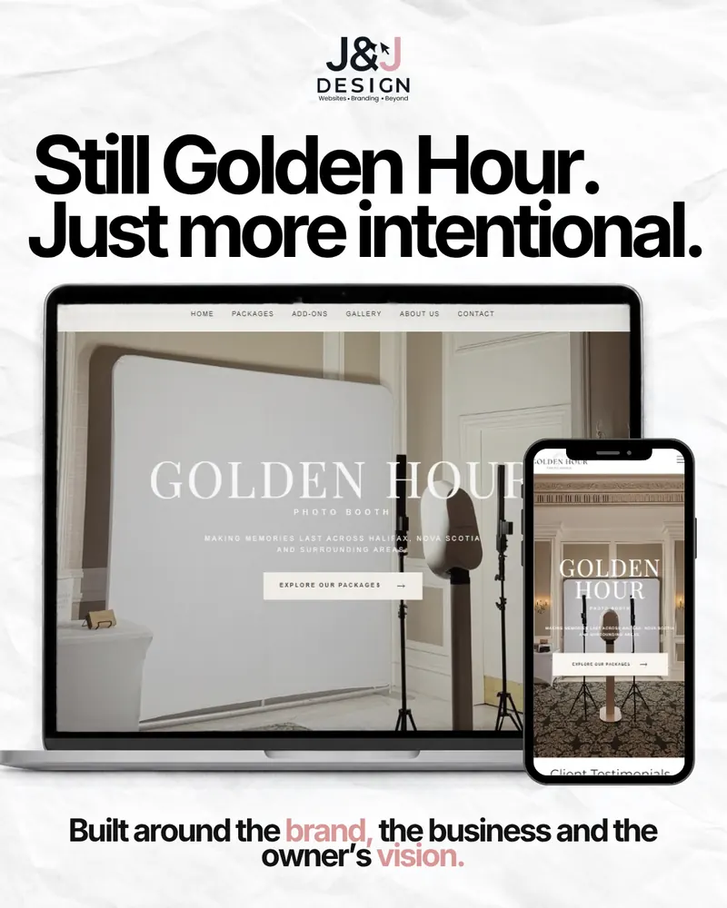
Slide: Still Golden Hour, just more intentional. The finished Golden Hour Photo Booth website on a laptop and a phone, built around the brand, the business and the owner's vision.

Golden Hour Photo Booth brings photo booths to weddings and events across Nova Scotia. The owner had already built her own website, and it was not a bad one. Her packages, business details, photos and contact information were all there.

What it did not have was room. Everything sat on one long page, and the site was not delivering the experience she pictured for her brand. She also had something many clients do not: a clear vision of what she wanted. Our job was to help shape that vision into a website. This carousel from our Instagram walks through how, and below we go through it slide by slide.

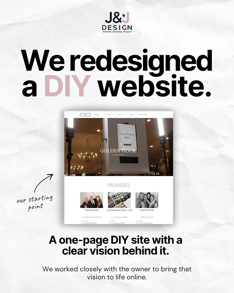
Carousel cover: We redesigned a DIY website. A screenshot of the original one-page Golden Hour Photo Booth site, labelled our starting point, with the caption: a one-page DIY site with a clear vision behind it.
Slide 1 of 6

We redesigned a DIY website

Our starting point was a one-page site the owner had built herself, with a clear vision behind it. We worked closely with her to bring that vision to life online.

A lot of our redesign projects start like this. A DIY site is not a failure. It is usually proof that the owner knows what they want to say, and simply ran out of time, tools or patience to make it look and work the way they imagined.
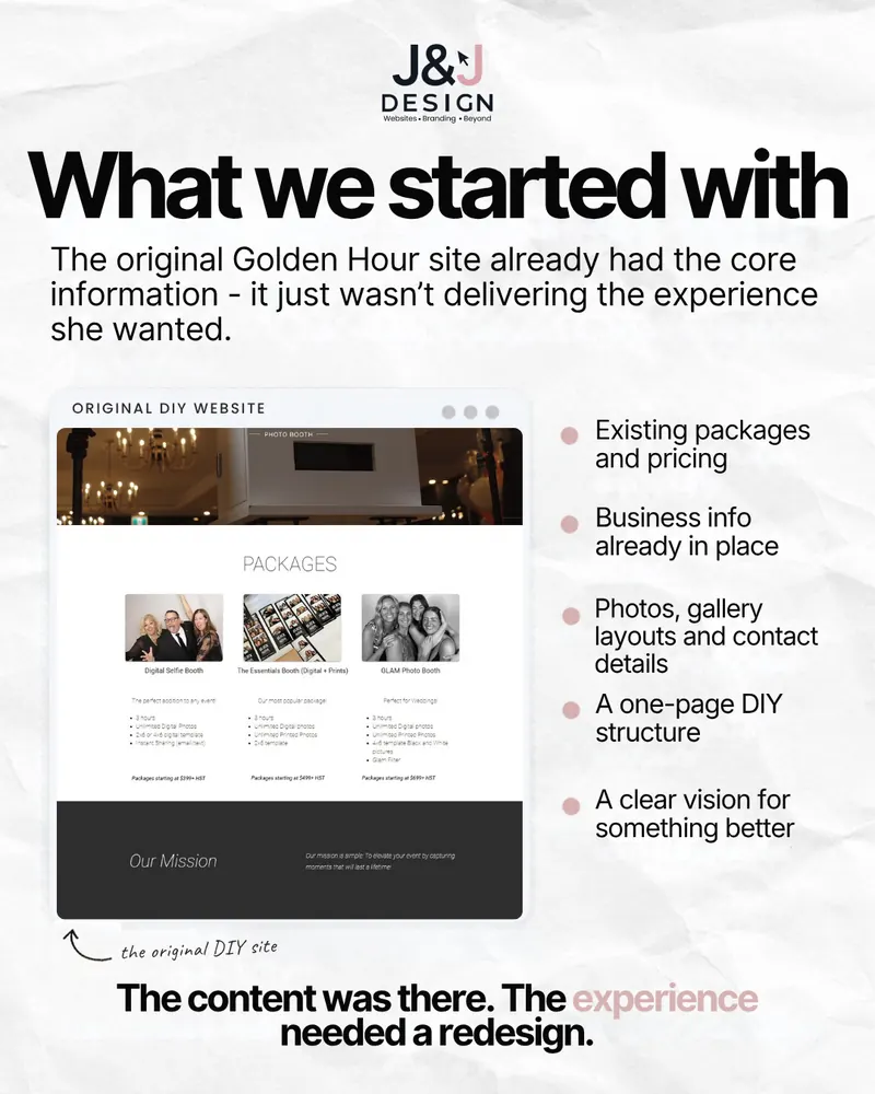
Slide: What we started with. The original Golden Hour site already had the core information, it just was not delivering the experience she wanted. A screenshot of the original DIY website, with existing packages and pricing, business info, photos, gallery layouts and contact details, a one-page DIY structure and a clear vision for something better.
Slide 2 of 6

What we started with

The original Golden Hour site already had the core information in place:

  • Existing packages and pricing
  • Business info
  • Photos, gallery layouts and contact details
  • A one-page DIY structure
  • A clear vision for something better

That changes the job. We did not need to invent a business on paper. We needed to take what was there and present it properly.

The content was there. The experience needed a redesign.

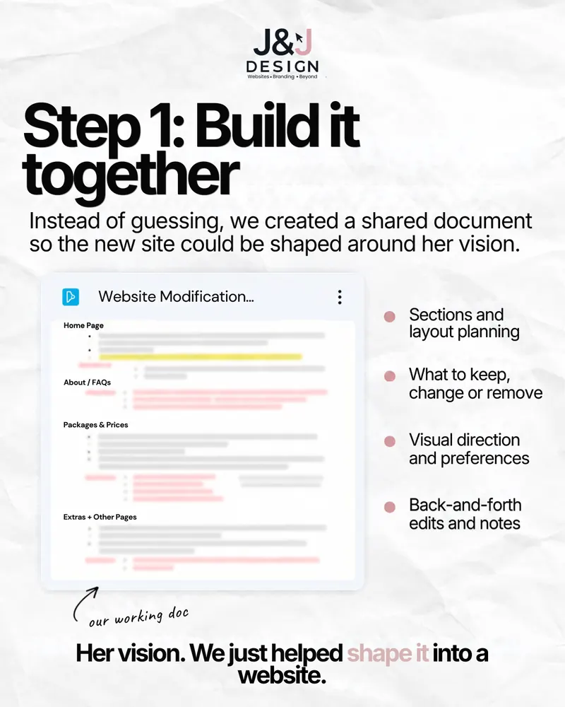
Slide: Step 1, build it together. Instead of guessing, we created a shared document so the new site could be shaped around her vision. A Website Modification document covers sections and layout planning, what to keep, change or remove, visual direction and preferences, and back-and-forth edits and notes.
Slide 3 of 6

Step 1: Build it together

Instead of guessing, we created a shared working document so the new site could be shaped around her vision, page by page. It covered:

  • Sections and layout planning
  • What to keep, change or remove
  • Visual direction and preferences
  • Back-and-forth edits and notes

A shared document sounds simple, and it is. It also saves a lot of back-and-forth. Every decision is written down in one place, the owner can comment whenever it suits her, and nobody has to remember what was said on a phone call three weeks ago.

Her vision. We just helped shape it into a website.

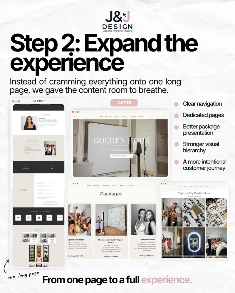
Slide: Step 2, expand the experience. Instead of cramming everything onto one long page, we gave the content room to breathe. A before screenshot of the one long page beside after screenshots of the new homepage, packages page and gallery, with clear navigation, dedicated pages, better package presentation, stronger visual hierarchy and a more intentional customer journey.
Slide 4 of 6

Step 2: Expand the experience

Instead of cramming everything onto one long page, we gave the content room to breathe:

  • Clear navigation
  • Dedicated pages
  • Better package presentation
  • Stronger visual hierarchy
  • A more intentional customer journey

Dedicated pages are not just tidier. Each one can focus on a single question a visitor has, like “what packages do you offer?” or “what does the booth look like at an event?”, and each one gives Google something specific to show in search results. That is part of how we approach SEO on every build.

From one page to a full experience.

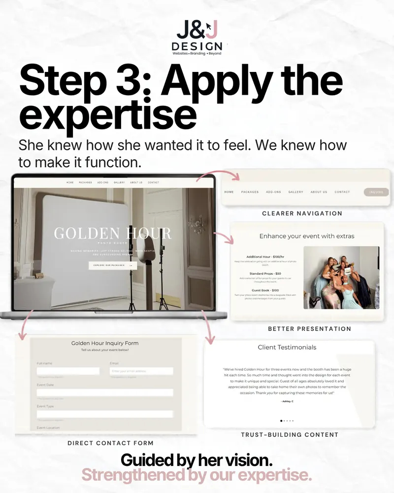
Slide: Step 3, apply the expertise. She knew how she wanted it to feel, we knew how to make it function. The new Golden Hour homepage on a laptop, with call-outs for clearer navigation, better presentation of event extras, a direct contact form and trust-building client testimonials.
Slide 5 of 6

Step 3: Apply the expertise

She knew how she wanted it to feel. We knew how to make it function. Four changes did most of the work:

  • Clearer navigation: Home, Packages, Add-ons, Gallery, About and Contact, with an Inquire button always in reach.
  • Better presentation: add-ons like extra hours, props and a guest book get their own section instead of a line of small print.
  • A direct contact form: an inquiry form that asks for the event date, type and location up front, so the first reply can be a real answer.
  • Trust-building content: client testimonials placed where people are deciding.

This is the part a client should not have to think about: how a page leads someone from “this looks nice” to “let's book it”. It is what our website design work is really about.

Guided by her vision. Strengthened by our expertise.

Slide: Still Golden Hour, just more intentional. The finished Golden Hour Photo Booth website on a laptop and a phone, built around the brand, the business and the owner's vision.
Slide 6 of 6

Still Golden Hour. Just more intentional.

The finished site still feels like Golden Hour: the same elegant, warm brand the owner started with, now with the structure to match. It works just as well on a phone as it does on a laptop.

See the finished site at goldenhourphotobooth.ca, or browse it alongside our other builds in the portfolio.

Built around the brand, the business and the owner's vision.

Is your DIY site ready for a redesign?

If you built your own website and it still has the right information, you are closer than you think. The signs it is time for a redesign usually look like this: everything lives on one long page, your packages or services are hard to compare, and the site does not feel like the quality of your work.

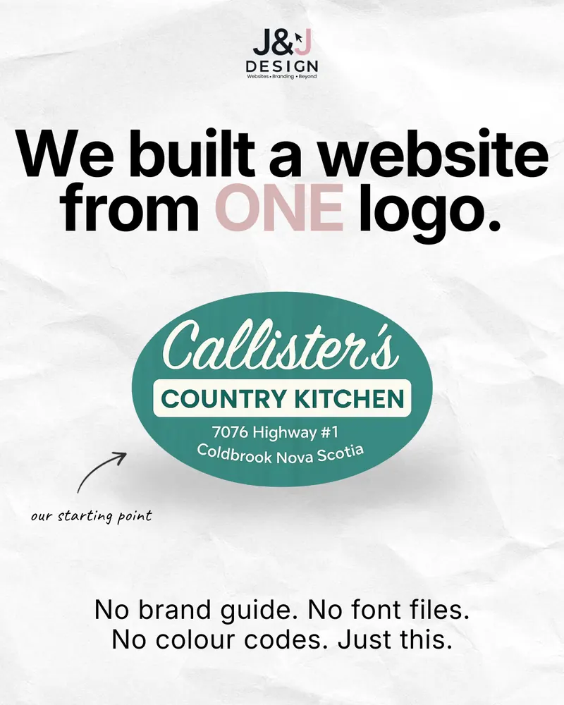
A redesign does not mean starting over. As with Callister's Country Kitchen, we start from what already exists. If you are weighing it up against staying on a builder, our breakdown of what website builders really cost is a good place to start.

The short version

What this project proves.

  1. A DIY site is a head start. If the content is there, the redesign is about experience, not starting over.
  2. Write the vision down. A shared document turns “I'll know it when I see it” into clear decisions.
  3. Give content room. Dedicated pages and clear navigation turn one long scroll into a customer journey.
Keep reading

More straight talk from our feed.

Outgrown your DIY site?

Keep your vision. Upgrade the experience.

Send us your current website and tell us what you wish it did better. We will show you what we would keep, what we would change, and quote it up front.