Case study · Coldbrook, NS

Callister's Country Kitchen: building a brand backwards

A family restaurant in Coldbrook, Nova Scotia, with one logo and no brand guide. Here is how we decoded what already existed and turned it into a brand system and a website that feels like Callister's.

3 min read 7-slide carousel

Visit the live site →

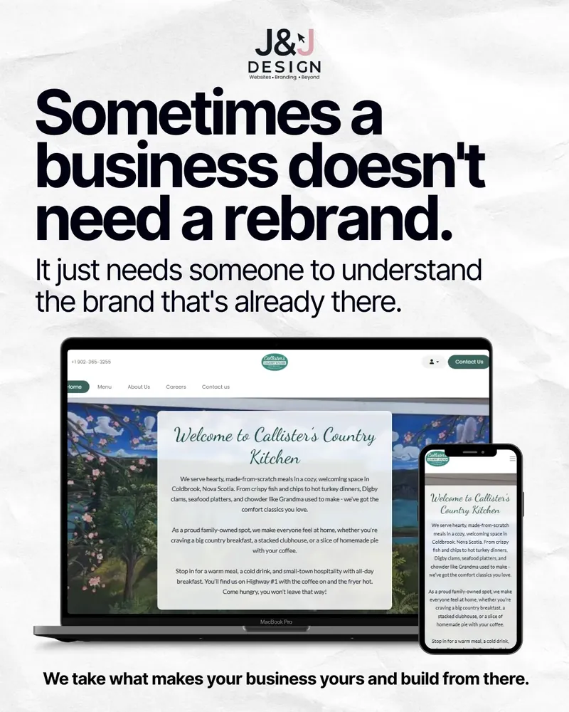
Slide: Sometimes a business doesn't need a rebrand, it just needs someone to understand the brand that's already there. The finished Callister's website on a laptop and phone.

Callister's Country Kitchen is a family restaurant on Highway 1 in Coldbrook, in Nova Scotia's Annapolis Valley. It serves hearty, made-from-scratch comfort food and runs a homemade ice cream shop, and it is the kind of place locals already love. What it did not have was anything a designer usually starts from.

No brand guide. No original logo file. No known fonts or colours. So instead of starting with a mood board, we started with the logo itself and worked backwards. This carousel shows the process, step by step.

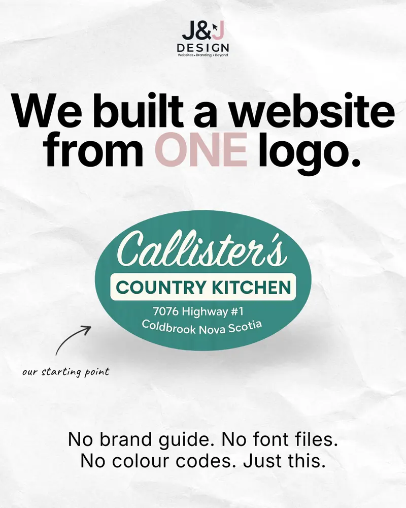
Carousel cover: We built a website from ONE logo. The Callister's Country Kitchen oval logo, 7076 Highway 1, Coldbrook Nova Scotia, marked our starting point. No brand guide. No font files. No colour codes. Just this.
Slide 1 of 7

We built a website from one logo

No brand guide. No font files. No colour codes. Just the Callister's Country Kitchen sign, with its address on Highway 1 in Coldbrook.

That logo was our entire starting point. Everything that follows, from the colour palette to the finished website, was worked out from it.

No brand guide. No font files. No colour codes. Just this.
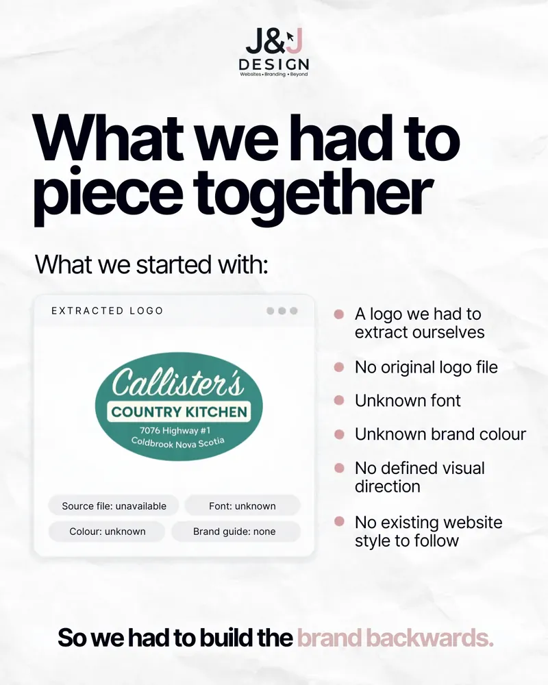
Slide: What we had to piece together. The extracted Callister's Country Kitchen logo, with source file, font, colour and brand guide all marked unknown.
Slide 2 of 7

What we had to piece together

What we started with:

  • A logo we had to extract ourselves
  • No original logo file
  • Unknown font
  • Unknown brand colour
  • No defined visual direction
  • No existing website style to follow

This is more common than you would think. Plenty of long-running local businesses have a logo someone made years ago, and the original files are long gone.

So we had to build the brand backwards.

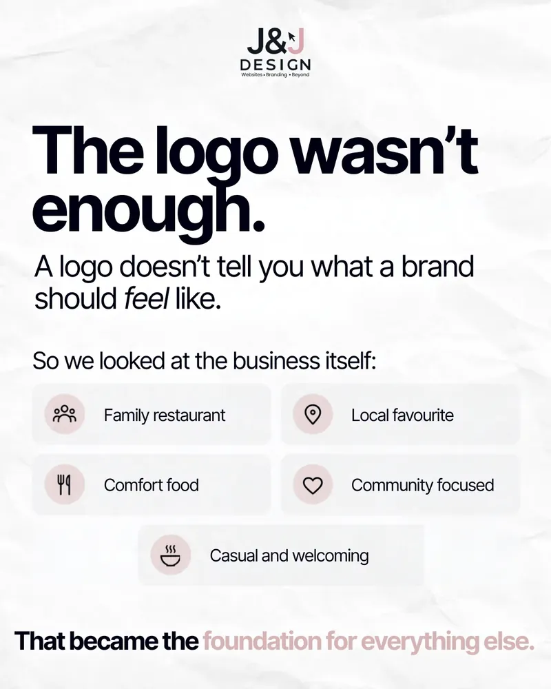
Slide: The logo wasn't enough. A logo doesn't tell you what a brand should feel like, so we looked at the business: family restaurant, local favourite, comfort food, community focused, casual and welcoming.
Slide 3 of 7

The logo wasn't enough

A logo does not tell you what a brand should feel like. So we looked at the business itself:

  • Family restaurant
  • Local favourite
  • Comfort food
  • Community focused
  • Casual and welcoming

This is the step that separates branding from decoration. Every later choice, from typeface to photo style, was checked against that list.

That became the foundation for everything else.

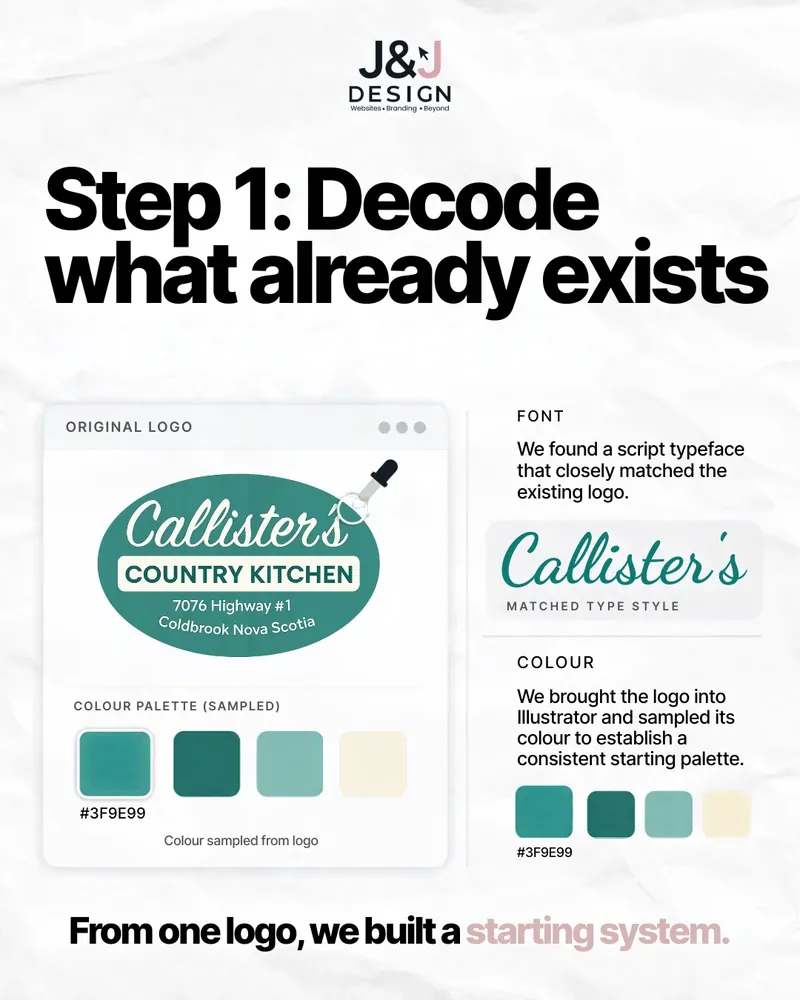
Slide: Step 1, decode what already exists. The original logo with a colour palette sampled from it (#3F9E99) and a script typeface matched to the logo lettering.
Slide 4 of 7

Step 1: Decode what already exists

We brought the logo into Illustrator and sampled its colour to set a consistent starting palette, anchored on a teal green (#3F9E99).

Then we found a script typeface that closely matched the lettering in the existing logo, so new headings would feel like they belonged next to the sign customers already recognize.

From one logo, we built a starting system.

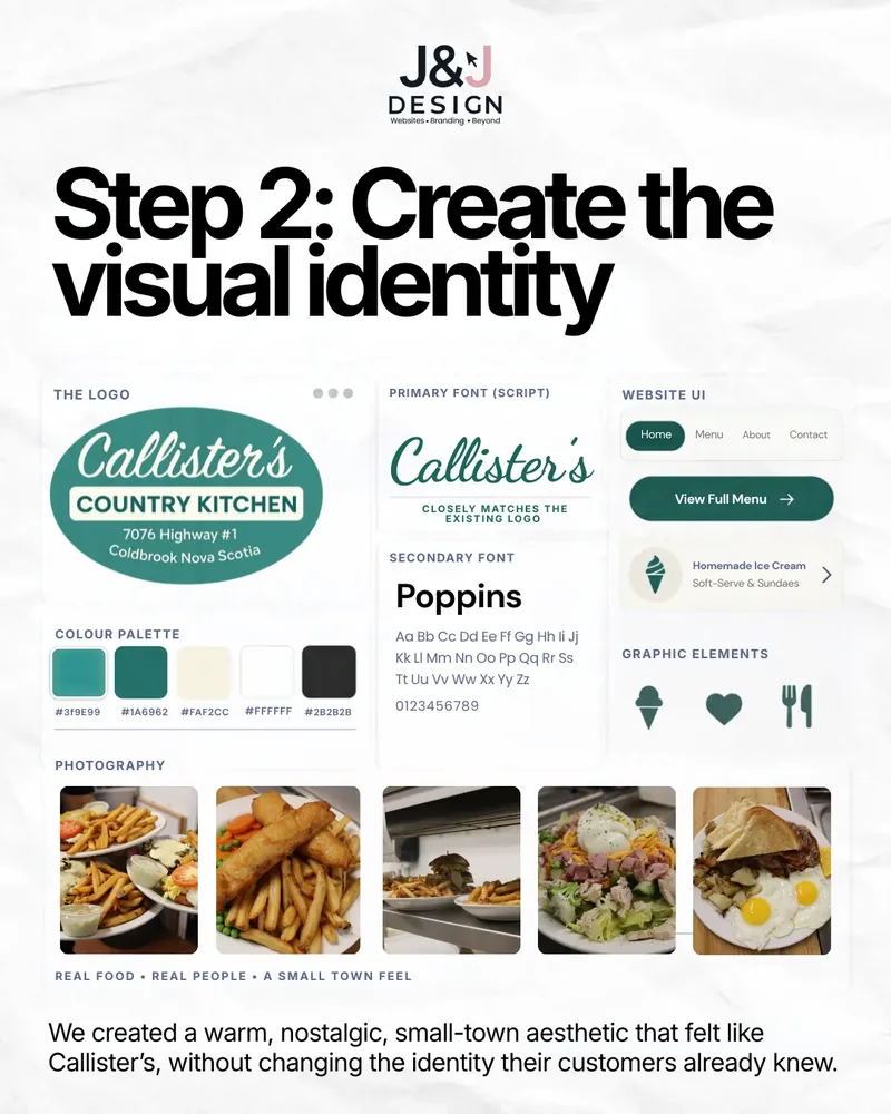
Slide: Step 2, create the visual identity. Logo, script and Poppins fonts, a teal, green, cream, white and charcoal palette, ice cream, heart and cutlery icons, and real food photography.
Slide 5 of 7

Step 2: Create the visual identity

With the basics decoded, we built them into a full identity:

  • Primary font: a script that closely matches the existing logo
  • Secondary font: Poppins, clean and friendly for menus and body text
  • Colour palette: teal #3F9E99, deep green #1A6962, warm cream #FAF2CC, white and charcoal #2B2B2B
  • Graphic elements: simple ice cream, heart and cutlery icons
  • Photography: real food, real people, a small-town feel

The result is a warm, nostalgic, small-town look that feels like Callister's, without changing the identity their customers already knew. This is what our logo design and branding work looks like in practice.

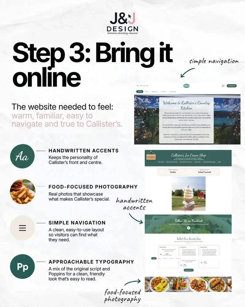
Slide: Step 3, bring it online. The Callister's website with handwritten accents, food-focused photography, simple navigation and approachable typography.
Slide 6 of 7

Step 3: Bring it online

The website needed to feel warm, familiar, easy to navigate and true to Callister's. Four decisions did most of the work:

  • Handwritten accents keep the personality of Callister's front and centre.
  • Food-focused photography: real photos that show what makes Callister's special.
  • Simple navigation: a clean, easy layout so visitors find what they need fast.
  • Approachable typography: the original script paired with Poppins, friendly and easy to read.

Like every project in our portfolio, it was designed around the business, not a template. See how we approach web design for Nova Scotia businesses.

Slide: Sometimes a business doesn't need a rebrand, it just needs someone to understand the brand that's already there. The finished Callister's website on a laptop and phone.
Slide 7 of 7

Sometimes a business doesn't need a rebrand

It just needs someone to understand the brand that is already there. Callister's customers did not need a new logo to recognize their favourite restaurant. They needed the website to finally match it.

See the finished site at callisterscountrykitchen.ca.

We take what makes your business yours and build from there.

What Callister's said about it

“J&J Design built our website with zero direction from us and absolutely nailed it. They managed to perfectly capture exactly what we needed, making the entire process seamless. Super professional, easy to work with, and they clearly know their stuff.”

Callister's Country Kitchen, website design review

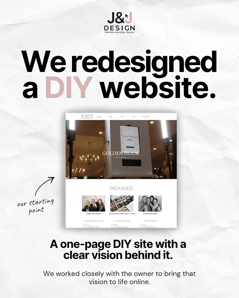
Starting from a DIY website instead of a lone logo? Read how we approached the Golden Hour Photo Booth redesign.

The short version

What this project proves.

  1. No brand guide? No problem. Everything we needed was hiding in the existing logo.
  2. Feel before fonts. Define what the business is like, then choose type, colour and photos to match.
  3. Evolution, not revolution. Keep what customers recognize and make it consistent everywhere.
Keep reading

More straight talk from our feed.

Your brand is already in there

Let's build from what makes you, you.

Logo files lost? No brand guide? We will decode what you already have and build a website and brand that feel like your business.